
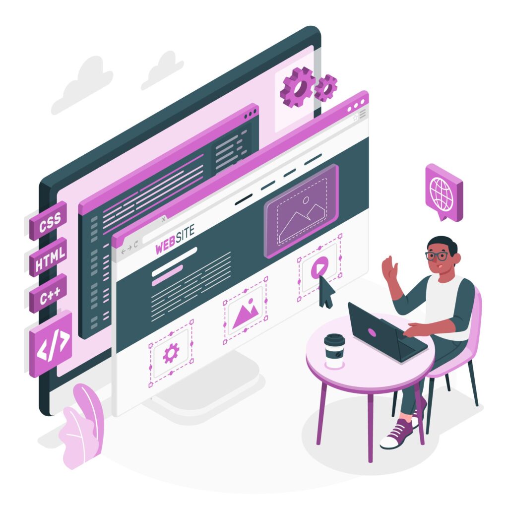
How to Excel at Website Design: A Comprehensive Guide
In the digital era, the essence of website design transcends mere aesthetics. It embodies a comprehensive journey encompassing research, meticulous planning, development, and a suite of other vital components necessary for crafting an exceptional online presence. At the heart of a successful website lies its ability to merge usability with utility, with user-centric design principles guiding this seamless coalition. Ensuring simplicity, navigability, and responsiveness, effective website design works as the linchpin in not only captivating users but also in bolstering a business’s performance metrics, from brand awareness to customer satisfaction.
As the digital landscape continues to evolve at breakneck speeds, businesses face a pressing need to adapt their online interfaces to stay ahead. A well-strategized website design accommodates these shifts with agility, knitting together elements like SEO-friendly layouts, mobile-responsiveness, and user engagement tactics. Leveraging tools such as Wix and other website builders, coupled with the expertise of seasoned web designers, organizations can pivot towards web page designs that are not only aesthetically pleasing but also primed for performance. In an age where every interaction counts, custom website design and professional web design approaches are essential for any company aspiring to make a significant impact online—be it through an engaging portfolio website, an expansive ecommerce platform, or a high-converting landing page.
The Evolution of Web Design
The journey of website design has been nothing short of revolutionary, with its roots tracing back to the early 1990s. During this era, the digital canvas was starkly different from today’s vibrant and interactive web pages. Websites were predominantly text-based, crafted with simple HTML code that laid the groundwork for the World Wide Web as we know it.
1990s Milestones:
- 1991: The World Wide Web is born.
- 1993: The first image is uploaded on the Internet, paving the way for multimedia content.
- 1994: Yahoo launches, becoming a pivotal portal for internet users.
- 1995: JavaScript and PHP 1.0 emerge, introducing interactive and dynamic capabilities to web pages.
- 1996: The formation of W3C (World Wide Web Consortium) sets standards for the web.
As web design entered the latter half of the 1990s, it began to embrace more visual and interactive elements. The introduction of CSS in 1995 allowed web designers to separate content from presentation, which was a significant leap forward. This period also witnessed the rise of Macromedia Flash, which brought animations and multimedia content to the forefront, transforming websites into rich, engaging experiences.
The turn of the millennium marked a shift towards enhancing user experience, with a focus on usability and content delivery. This era saw the introduction of concepts that are now cornerstones of modern website design:
2000-2010 Innovations:
Responsive Web Design: Websites could now adapt to various screen sizes, improving accessibility.
Adaptive Design: Tailored to specific devices, offering optimized layouts for an array of gadgets.
The 2010s heralded a new age of simplicity and user-centric design. Minimalism became a guiding principle, stripping away the superfluous and honing in on essential content. User Experience (UX) design and mobile web access became paramount, reflecting the shift in user behavior towards smartphones and tablets.
2010s Trends:
Minimalism: Simplified visuals and layouts that prioritize user engagement.
Mobile-First: Designing for mobile devices before scaling up to desktops or other larger screens.
Looking to the future, AI is poised to be the next frontier in website design. Tools like ChatGPT are set to offer even more interactive and personalized user experiences, blurring the lines between human and machine-led design processes.
The evolution of website design is a testament to the relentless pursuit of innovation and user satisfaction. As we continue to witness and participate in this evolution, it’s clear that the principles of effective website design—usability, adaptability, and engaging content—remain constant, even as the tools and technologies at our disposal evolve.
Understanding the Basics of Web Design
Web design stands at the forefront of creating an impactful online presence, serving as a crucial intersection between graphic design and functionality to enhance user experience. The process involves a strategic layout of content and interactive elements that enable users to navigate and interact with a website effortlessly. When discussing website designs, it’s essential to distinguish between the two primary approaches—adaptive and responsive. Adaptive designs cater to specific screen sizes, creating a custom experience on predetermined devices. In contrast, responsive designs employ flexible grid layouts that dynamically adjust to any screen size, ensuring content looks great on any device, from smartphones to desktops.
Principles of Good Web Design:
- Balance ensures that the layout distributes elements so that no one section overpowers another.
- Contrast can be achieved through size, color, and shape, guiding the visitor’s attention to key components.
- Emphasis focuses on drawing attention to priority sections of the webpage.
- Rhythm and Movement guide the user’s eye across the page in a fluid, natural flow.
- Hierarchy establishes a clear order of importance within the content.
- Unity ties all design elements together cohesively.
- White Space is not merely empty space; it’s a powerful design element that helps to declutter and prioritize content.
The functional elements that underpin successful website design include:
- Navigation: It’s the roadmap of a website and should be intuitive and consistent.
- Speed: A fast-loading website is essential to keep users engaged.
- SEO: By optimizing for search engines, a website becomes more discoverable.
- UX: A stellar user experience is what keeps users coming back.
Visual elements play a pivotal role in defining a website’s character and usability:
- Header and Footer: These bookend the content, containing key information accessible from any part of the website.
- Color Scheme: It sets the mood and should align with brand identity.
- Background: Can be used for branding, context, or to highlight content.
- Typography: Essential for readability and personality.
- Imagery: Helps to communicate a message more powerfully than words alone.
- Animation: When used sparingly, it can enhance interaction and engagement.
In website designing online, the user should always be the focal point, as the ultimate goal of a website is to fulfill the user’s needs and desires. Quality and credibility are paramount, with users typically scanning rather than reading in-depth. They seek instant gratification and will quickly leave a site if it does not meet their expectations. Therefore, web designers must prioritize simplicity and intuitive design, allowing users to feel in control with minimal effort.
To encapsulate these principles, here are 10 key points to consider:
- Clarity: Websites should be self-explanatory, guiding users without confusion.
- Efficiency: Minimize user requirements to engage with the website.
- Direction: Use visual cues to lead users through your site.
- Accessibility: Clearly display available functions and features.
- Conciseness: Be direct and to the point in your content.
- Simplicity: Embrace the ‘keep it simple’ principle in design choices.
- Breathing Room: Utilize white space to focus user attention.
- Communication: Match the presentation to user capabilities.
- Familiarity: Stick to conventions to ease user interaction.
- Testing: Continuously test and refine the user experience.
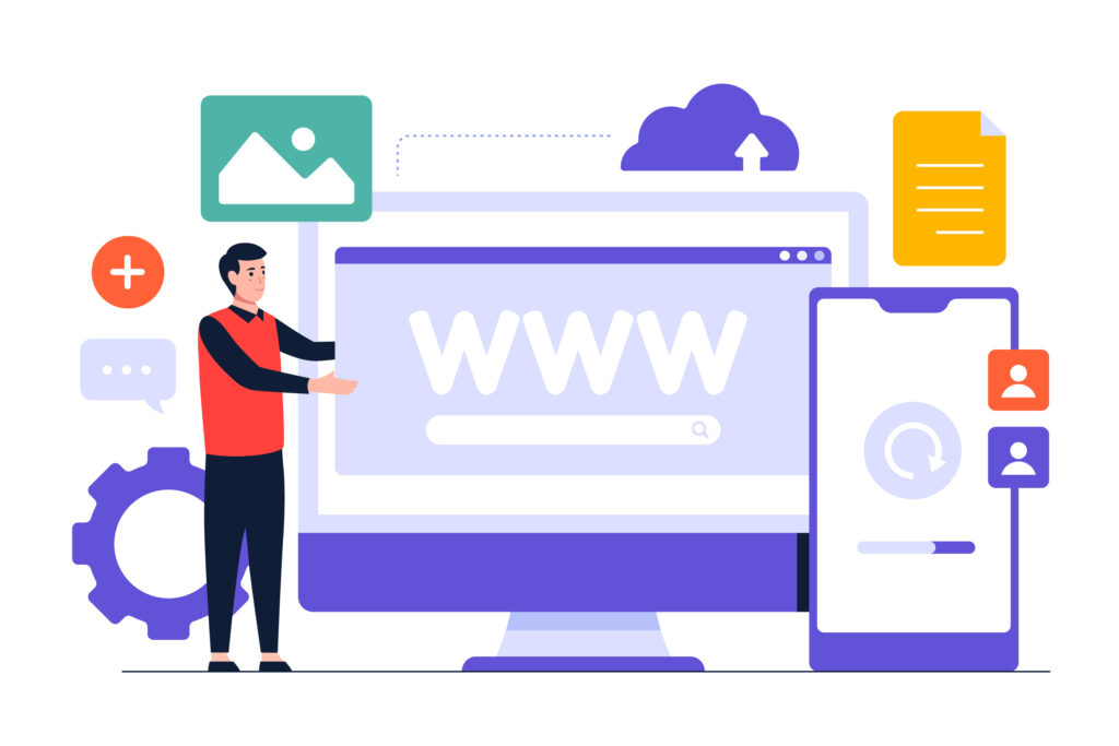
In the realm of website development, Wix stands out as a website builder that embodies these principles, offering a range of templates and tools that cater to both adaptive and responsive website designs. For those seeking custom website design or professional web design services, relying on a website design company like DXT Technologies ensures that every aspect of the user experience is crafted with expertise. Whether it’s a portfolio website, an ecommerce website, or an engaging landing page design, the integration of these design fundamentals is crucial for a website’s success.
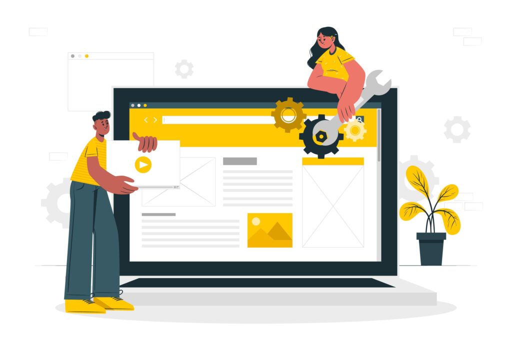
Key Web Design Tools Every Designer Should Know
Web designers have a plethora of tools at their disposal, each tailored to streamline specific aspects of the design process. From code editors to graphic design software, these tools are indispensable for creating professional and high-quality website designs.
Code Editors:
Sublime Text: Known for its speed and efficiency, it’s a favorite among developers for writing and editing code.
- Atom: Offers a customizable interface and a robust plugin ecosystem, making it adaptable for various web design needs.
- Visual Studio Code: Combines simplicity with powerful features like debugging and version control, ideal for larger projects.
Graphic design tools: Graphic design tools are the cornerstone of visual creativity, allowing web designers to craft everything from simple icons to complex layouts with ease.
Graphic Design Tools:
- Adobe Photoshop: The go-to tool for raster-based graphics, perfect for editing photos and creating detailed web graphics.
- Illustrator: Adobe’s vector design powerhouse, enabling designers to create scalable graphics without losing quality.
- Affinity Designer: A cost-effective alternative to Adobe’s suite, it offers robust features for both vector and raster design work. Collaboration and prototyping platforms are critical for team-based projects, enabling designers to work together in real-time and test their ideas before going live.
Collaboration and Prototyping Platforms:
- Figma: Allows multiple users to work on the same project simultaneously, streamlining the design collaboration process.
- Sketch: A vector-based tool that’s great for wireframing and prototyping, with a focus on user interface design.
- Adobe XD: Known for its user-friendly interface, it’s a complete package for designing, prototyping, and sharing user experiences.
Web design also involves a fair share of testing and management to ensure that the final product is not only visually appealing but also functional and reliable.
Testing and Management Tools:
- Marker.io: Simplifies the feedback process by allowing stakeholders to provide comments directly on live websites.
- WP Engine’s Smart Plugin Manager: Automates the plugin update process, reducing the risk of security vulnerabilities.
- Git: An essential tool for version control, it helps teams manage changes to project files over time.
To cater to the diverse needs of web designers, whether they are seasoned professionals or just starting out, there are tools designed to fit every skill level.
Beginner-Friendly Web Design Software:
- CMS Hub and WordPress: Offer user-friendly interfaces with a plethora of themes and plugins, ideal for those new to website designing online.
- Wix: A website builder known for its simplicity, allowing users to create custom website designs without needing to code.
- Trello and Canva: Provide easy-to-use planning and design interfaces, making project management and graphic creation accessible to all.
- Google Web Designer: A free tool that offers no-code, drag-and-drop capabilities for creating interactive HTML5-based designs.
For those looking to deepen their web design and development skills, educational resources like Skillcrush Break Into Tech provide comprehensive learning experiences, complete with self-paced classes and career counseling to ensure a well-rounded education in the field.
Incorporating these tools into the web design workflow can significantly enhance a designer’s ability to create responsive web designs, manage website development effectively, and ultimately deliver a polished and user-friendly end product. Whether working on a portfolio website, an ecommerce website, or a landing page design, these tools support web designers in crafting digital experiences that are both aesthetically compelling and functionally robust.
The Significance of Responsive and Adaptive Design
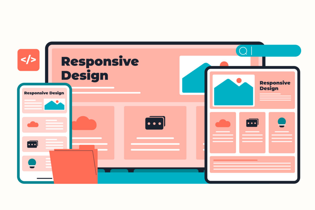
Website interface development planning. Devops team flat characters working. UI, UX, content design. Computer software creation and web development. Vector isolated concept metaphor illustration
In the realm of website design, the significance of creating an optimal viewing experience across different devices cannot be overstated. With the surge in mobile traffic and the diversity of screen sizes, web designers are often faced with a critical decision: whether to employ responsive or adaptive design techniques. Both approaches aim to enhance the user experience but differ fundamentally in execution and application.
Responsive Web Design (RWD):
- Fluidity: RWD is like water, taking the shape of its container, meaning it adapts to the screen size, whether it’s a mobile phone, tablet, or desktop.
- CSS Media Queries: These are the backbone of responsive design, allowing the website’s content to fluidly adjust to various screen resolutions and orientations.
Pros:
- Flexibility: Serves all devices with the same code base; content just flows naturally.
- SEO Advantage: Google favors mobile-friendly designs, potentially boosting rankings.
- Maintenance: Single update affects all versions, saving time and resources.
Cons:
- Performance: Can result in longer load times due to loading all assets, regardless of device.
- Complexity in Coding: May require more upfront coding effort to ensure seamless adaptability.
Adaptive Web Design (AWD):
- Tailored Layouts: AWD customizes the viewing experience with predefined screen sizes, delivering the most suitable layout.
- Device Recognition: The server detects the device type and loads the appropriate layout, enhancing speed and user experience.
Pros:
- Optimized Performance: Faster loading times as only device-specific assets are loaded.
- Controlled Design: Each layout can be fine-tuned for the intended device, ensuring a consistent brand experience.
Cons:
- Design Effort: Requires designing multiple layouts, which can be resource-intensive.
- Scalability: May not accommodate new devices as easily, potentially requiring additional layouts.
Choosing between responsive and adaptive design strategies hinges on various factors, including the project’s scope, the desired level of control over the design on different devices, and the specific goals for user experience. For instance, responsive design is typically the go-to approach for new website development projects or for sites with a vast array of content that needs to be accessible on any screen. Conversely, adaptive design might be the preferred choice for businesses looking to revamp an existing, complex website with a focus on mobile users.
Ultimately, the decision between responsive and adaptive design should align with the website’s objectives. For a seamless user experience that caters to the ever-growing mobile user base, responsive web design is a solid choice. It supports diverse screen sizes and has a positive impact on SEO. On the other hand, adaptive design offers faster load times and a more controlled environment, which can be crucial for websites with heavy customization and those seeking to differentiate their mobile and desktop experiences.
Incorporating these design philosophies effectively requires the expertise of a professional web design company. With tools like Wix, a robust website builder, and the skills of proficient web designers, businesses can embark on website designing online that resonates with their audience. Whether it’s for a portfolio website, an ecommerce website, or a landing page design, understanding and applying the principles of responsive and adaptive design is pivotal in today’s digital landscape.
Trends and Innovations in Web Design
Web design in 2024 continues to push the boundaries of creativity and technology, focusing on enhancing user experience, incorporating motion for intuitive navigation, and increasing interactivity. Here’s a closer look at the trends and innovations shaping the future of website design:
User Experience Innovations:
- Content Personalization: Machine learning algorithms analyze user behavior to customize content, making each interaction unique.
- Voice Search Optimization: Simplifies the user journey, allowing for multitasking and fostering loyalty through ease of use.
- Single-Page Applications (SPA): These enable faster loading speeds and smoother navigation, keeping users engaged without the wait.
Technological Advancements:
- Blockchain: Provides a secure and transparent method for transactions, instilling trust in online activities.
- Progressive Web Apps (PWA): Merge the capabilities of websites and mobile apps, leading to higher user engagement.
- Internet of Things (IoT): Enables continuous data exchange, offering personalized user experiences through connected devices.
- Serverless Architecture: Prevents system overload and data loss, optimizing development resources.
- Cloud Computing: Delivers flexibility and scalability while reducing costs and safeguarding against data loss.
Design and Interaction Trends:
- Motion UI: Makes digital products feel more alive and responsive to user interactions.
- Interactive 3D Models and Gamified Design: Engage users by adding depth and fun to the browsing experience.
- Dark Mode and Organic Shapes: Offer visual comfort and a modern aesthetic that stands out.
- Data Visualization: Transforms complex data into visually appealing and understandable graphics.
Incorporating these elements into web page designs not only captivates users but also enhances the overall functionality of websites. Web designers utilizing platforms like Wix, a versatile website builder, can effectively integrate these trends into custom website designs. Whether the goal is to create an immersive portfolio website, a user-friendly ecommerce website, or an impactful landing page design, these trends are essential tools in a web designer’s arsenal.
As the digital world evolves, so does the importance of responsive web design, ensuring that websites adapt flawlessly across various devices. A website design company specializing in responsive web design and website development can leverage these trends to build professional website designs that not only look great but also perform exceptionally. With a focus on user experience, security, and cutting-edge technology, the future of website design is poised to deliver even more personalized, engaging, and efficient online experiences.

Why rely on DXT Technologies for building professional websites for your business?
When considering professional website design, DXT Technologies emerges as a company with a wealth of resources and expertise to bring your digital vision to life. Here’s why businesses should consider partnering with DXT Technologies for their website development and design needs:
Diverse Expertise Across Industries: DXT Technologies isn’t limited to just one sector; they bring their web design and development prowess to a variety of fields including:
- Real Estate: Crafting immersive portfolio websites that showcase properties.
- Healthcare: Ensuring compliance and patient privacy with secure platforms.
- E-commerce: Building robust ecommerce websites that drive sales and enhance user experience.
- Fintech: Developing secure and innovative financial technology solutions.
Tailored Solutions and Technologies: The company stands out with its custom website design approach, utilizing a vast array of technologies to meet the unique demands of each project:
- Programming Languages: Mastery in Java, Python, PHP, and more.
- Frameworks: Expertise in React, Angular, Laravel, and .NET, among others.
- Mobile Development: Creating seamless experiences on Android and iOS/iPhone.
- Emerging Tech: Incorporating AI & ML, Blockchain, and IoT to keep your business at the forefront.
Comprehensive Service Offerings: DXT Technologies offers a full spectrum of services that cater to all aspects of professional web design and development:
- Initial Consultation: Start with a free discussion to understand your needs.
- MVP Development: Quickly launch a Minimum Viable Product to test your ideas.
- Full-Cycle Development: From concept to launch, with dedicated teams for each project.
- Specialized Areas: Benefit from their expertise in QA & Testing, cloud services, data engineering, and more.
- Platform Proficiency: Leverage their experience with Microsoft Power BI, Salesforce, SharePoint, and Amazon Web Services for integrated solutions.
Choosing DXT Technologies means entrusting your professional website design to a team that not only understands the technical side of website development but also appreciates the nuances of creating a user-centric web page design that resonates with your audience. Whether you’re looking to update an existing site with a fresh web design or starting from scratch with a custom website design, their dedicated team is equipped to deliver a product that aligns with your vision and business objectives.
Conclusion
Throughout this article, we’ve delved into the intricate tapestry of web design—its pivotal role in user engagement, the evolution of design practices through the decades, and the tools that breathe life into creative visions. We’ve illuminated the importance of striking a balance between aesthetics and functionality, highlighting responsive and adaptive design principles that cater to the diverse array of devices used to access the internet today.
As we culminate our discourse, we leave you with the idea that effective web design is not a fixed point but a fluid intersection of technology, art, and user needs. It’s a continuously evolving discipline that challenges designers to innovate and adapt. In this digital age, those who prioritize user experience and stay ahead of trends set themselves apart, crafting digital landscapes that are not only visually stunning but also intuitively navigable.
FAQs
How to Develop a Comprehensive Website
What steps are involved in creating a website from scratch?
To build a website from the ground up, follow these steps:
- Determine the type of website you want to create.
- Select a website builder that suits your needs.
- Choose a template that aligns with your vision.
- Tailor the template to reflect your brand’s identity.
- Organize your site’s structure thoughtfully.
- Add and arrange your website’s pages.
- Populate your pages with compelling content.
- Register a domain name for your website.
Website Design Best Practices
What are the top strategies for effective website design?
Here are the top 10 best practices for website design:
- Ensure easy navigation.
- Minimize text to avoid overwhelming users.
- Use a consistent color scheme.
- Utilize white space effectively.
- Incorporate texture to add depth.
- Employ images and visuals to enhance user engagement.
- Introduce dynamic content for a lively experience.
- Implement powerful calls to action (CTAs).
Establishing a Web Design Style Guide
How can I develop a web design style guide?
To create a web design style guide, consider the following:
- Reflect your brand’s values and mission.
- Set guidelines for logo usage.
- Establish a color scheme.
- Define typography rules.
- Consider the style of icons.
- Outline design considerations for key website components.
- Craft your brand’s tone of voice.
Analyzing Website Layout
How should one evaluate a website’s layout?
Assess your website’s design with these focus areas:
- Business goals: Ensure the design aligns with your objectives.
- User friendliness: Prioritize ease of use.
- Trustworthiness: Build credibility through design.
- Content quality and relevance.
- Regular testing for improvements.
- Aesthetics: Aim for a visually pleasing layout.
- Modernity: Keep up with current design trends.
- Functionality: Ensure all features work as intended.
Planning a Website in Steps
Define the goals of your website.
Identify your target audience.
Determine your unique selling proposition.
Secure a domain name and hosting services.
Choose a website builder that fits your needs.
Gather and create design elements.
Develop content for the main pages of your site.
Q: What is the fifth step in planning a website?
A: Step 5 in planning a website is structuring your site. Decide on the pages you’ll need and the features each will contain. Common pages include About and Contact, but your choices should cater to your business’s requirements.
The 7 C’s of Effective Website Design
What are the 7 C’s of designing an effective website?
The 7 C’s of effective website design are:
- Creativity
- Consistency
- Clarity
- Content
- Continuity
- Compatibility
- Customisation
Fundamental Rule of Web Design and Development
What is the most important rule in web design and development?
Consistency is paramount in web design. To achieve this, use uniform color schemes and fonts, similar page layouts, and images with a consistent aesthetic. For blog content, a uniform format enhances the user experience.
How do you develop a professional brand style guide?
Build a professional style guide with these six steps:
- Start with a compelling brand story.
- Set guidelines for logo usage.
- Include your brand’s core color palette.
- Dictate your typography hierarchy.
- Define your brand voice.
- Specify imagery and iconography that embodies your visual style.
Components of a Website Style Guide
What elements should be included in a website style guide?
website style guide should encompass:
Graphic elements
Typography
Color scheme
General formatting guidelines
This guide serves as a reference for developers to ensure a cohesive and consistent design across the website.
Essential Parts of Any Website Layout
What are the four main parts of any website layout?
Header
Navigation or Main Menu
Feature Image or Hero Image
Main Website Content
Sidebar
Footer
Card Design or Grid-Based Design
Characteristics of a Good Website Layout
What characterizes a well-designed website layout?
A good website layout is intuitive, visually appealing, and focuses on presenting the most important content prominently. It should facilitate a smooth user experience and engagement.